Perhaps it’s just for convenience that most macroeconomics textbooks still teach and discuss monetary and banking policy as if the 2008 and 2020 changes never happened. But when I recently supplemented a classroom discussion with the actual framework, I fell down a rabbit hole so disturbing that Bob Lee Swagger’s horrified line from Shooter, “What kind of sick mind would think of something like this?” (this is the TV version of the original), has been looping in my head ever since.
I knew these changes existed, but I had never fully grasped the perverse incentives they unleashed. Even assuming the best of intentions, the outcomes explain the devastation of Main Street and the staggering concentration of wealth and power on K and Wall Streets.
To understand this perversity, the evolution of modern central banking must be re-examined and retaught. What emerges is a turbo-charged Cantillon effect that drives today’s asset bubbles, crushes inflation-squeezed households, and creates the bizarre disconnect between soaring financial markets and the bleak job prospects facing my brother-in-law and his fellow recent college graduates.
What advocates once promised about government monetary intervention now bears little resemblance to the neutral, stabilizing force still taught in textbooks. To understand why stocks and home prices soar while middle- and lower-income households are crushed by inflation, we must consult the long-dead but brilliant Cantillon. Doing so reveals how Fisher’s equation of exchange misleads by concealing what matters most: who receives the new money first.
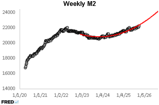
Since late 2022, M2 (black dots) has followed a remarkably stable quadratic trend (red curve). This path began midway through the Fed’s aggressive tightening cycle, triggered by inflation topping 9 percent and producing the first sustained M2 decline since the 1930s. Even though the Fed has been a net seller of securities since then, M2 growth turned positive in early 2023 and has accelerated along that red curve. It is now running near 5 percent year over year and could reach 9 percent by late 2026 if the curve holds. Against this backdrop, claims from President Trump, his allies, and Wall Street that the Fed is “too tight” reveal a deep misunderstanding of how monetary policy operates under the new banking framework.
This misunderstanding is widespread, extending from financial reporters to politicians in both major parties. For example, after the Fed announced a 50-basis point rate cut just over a month before last year’s election, Kamala Harris said, “While this announcement is welcome news for Americans who have borne the brunt of high prices, my focus is on the work ahead to keep bringing prices down.” As is typical, the party in the White House always wants the Fed to do more. In this case, “more” meant greater monetary expansion at the very moment M2 had just surged at a 7.4 percent annualized rate from the previous month, further feeding inflationary fires.
This confusion is rooted in textbooks that teach that the Fed’s Treasury operations affect changes in the federal funds rate. Under that framework, as an expanding economy increases the demand for reserves, the Fed must be a net buyer of securities to keep the federal funds rate at its target. This relationship appears in the chart below from 2003 through late 2007. As the economy began to overheat, the Fed raised the federal funds rate while keeping M2 (black) from curling upward. This kept its Treasury holdings (light green), total assets (dark green), and M2 on a stable path, growing at around 4-5 percent annually from January 2003 to December 2007.
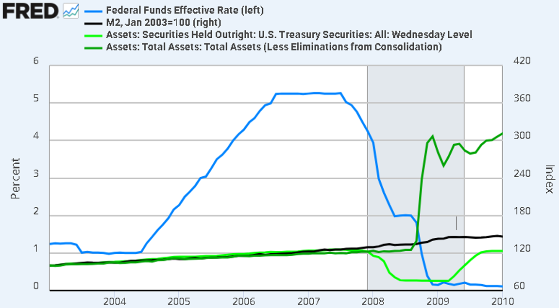
In late 2008, Treasury operations and the federal funds rate were decoupled as a single policy tool when Congress granted the Fed authority to pay interest on reserves (IOR) and lend to non-banks. The 145 percent surge in total assets between August and December 2008 turned IOR into a binding price floor for the federal funds rate and created trillions in what I call unemployed reserves. In the graph above, Treasury holdings fall sharply, total assets explode, M2 continues its steady trend, and the funds rate is pulled toward zero. From that moment forward, the Fed could buy or sell enormous quantities of securities without affecting the funds rate or M2 because IOR is a binding price floor that also acts as a dam, holding back a flood of newly-created money.
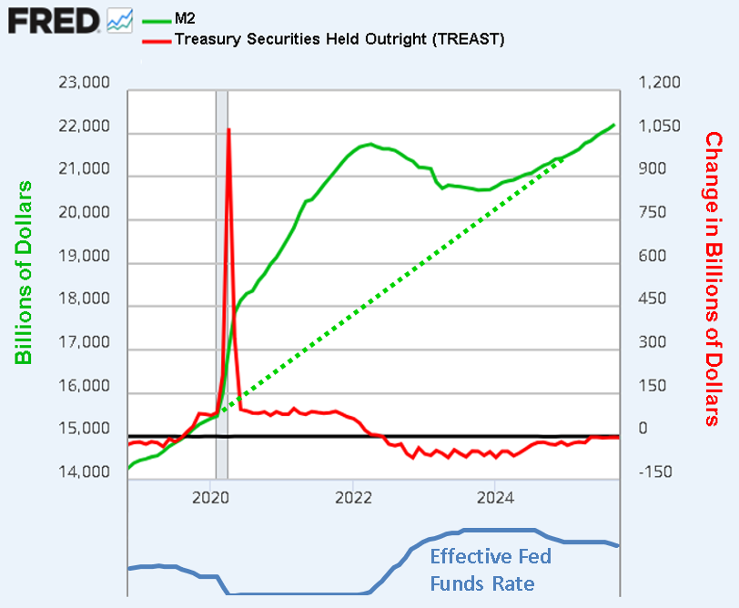
That dam burst in March 2020 when the Fed cut the IOR rate by 93 basis points (blue line below) and followed it a month later with record net purchases (red). With the fed funds rate pinned near zero by IOR for two years, M2 (green) settled into a linear path more than twice as steep as its pre-covid trend, driven by steady net purchases and rapid credit expansion. This produced the distinctive covid-era “M2 hump,” the gap between the solid and dotted green lines. When inflation proved persistent, the Fed reversed course. It first slowed net purchases, then gradually raised rates, followed by a period of steady net sales. After both plateaued at different times, net sales were eased toward zero, followed by a recent reduction in the IOR rate. Together, these steps produced the first prolonged contraction in M2 since the 1930s and confirmed that asset purchases and the federal funds rate are different policy levers.
These mechanics explain how the Fed lost control of M2, but they obscure the deeper question: who captured the new money and who paid the price? Aggregates like M2, CPI, and GDP hide the Cantillon effect. Trillions in new money, 9 percent inflation, or a 8 percent rise in nominal GDP tells us nothing about who received the new dollars first, whose assets inflated earliest, or who was left holding the bag of devalued cash. By aggregating away the order of receipt, these metrics reduce one of the largest wealth transfers in modern history to a “macro event.” To identify the true winners and losers, we must move beyond Fisher’s aggregates and trace actual lending flows, sector by sector, to expose the real channels of Cantillon redistribution.
Both Fisher and Cantillon agree that more money eventually raises prices, but only Cantillon explains who wins and who loses along the way. Fisher’s MV = PY treats money as neutral and, by relying on aggregates, hides the crucial sequence of injection that determines who receives new dollars first. From 2020 onward, trillions in Fed purchases flowed first through primary dealers into institutional investors, high-credit homeowners, and non-depository financial institutions (NDFIs), driving stocks and real estate higher long before CPI topped 9 percent. Wage earners, small businesses, and savers received the money only after rents, food, and energy had already surged, effectively paying an inflation tax to early recipients. By ignoring this distributional chain, Fisher’s framework sustains the myth of monetary neutrality.
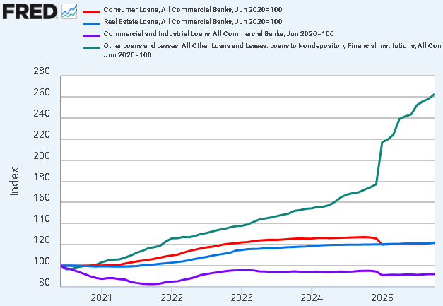
Disaggregated lending flows reveal what aggregates conceal: the mechanics of Cantillon redistribution. As shown below, loans to NDFIs (green line) consistently outpace real estate (blue), C&I (purple), and consumer (red) loans by a wide margin. New money does not spread evenly. Each dollar flows first to hedge funds, private credit vehicles, REITs, and prime brokers, who channel it into equities, bonds, and real estate, inflating asset prices long before households see meaningful wage gains. The green line is therefore the visible pipeline of the Cantillon transfer.
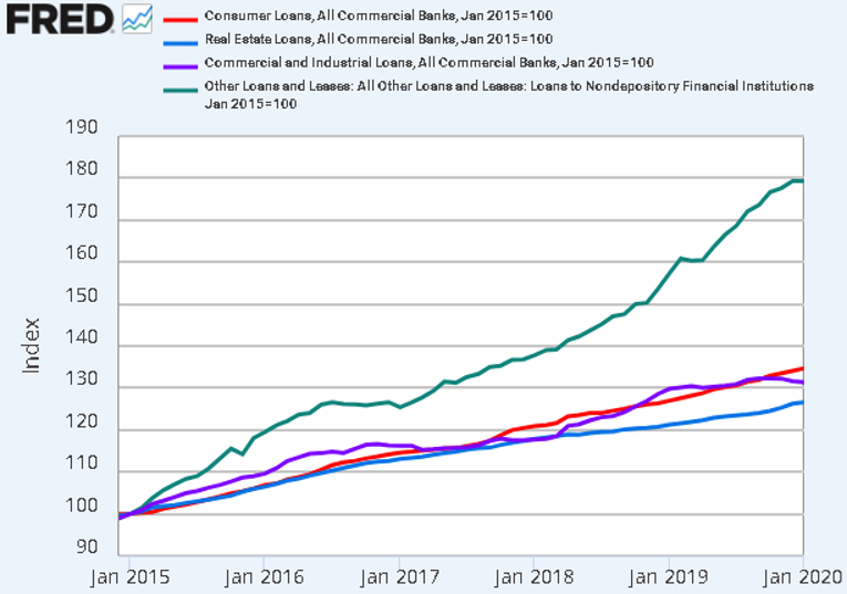
The next chart shows this effect intensifying in late 2024. Loans to NDFIs surged 48 percent in just ten months, while real estate lending rose only 1.4 percent and consumer and C&I loans actually declined by 3.1 percent and 2.6 percent, respectively.
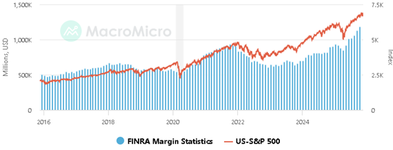
The following shows the Cantillon effect in overdrive. Margin debt (blue bars) surged past $1 trillion in mid-2025 for the first time in history, with five consecutive record prints, while the S&P 500 (orange) moved in near lockstep. Although banks earn IOR, higher returns come from lending to NDFIs that finance margin accounts. These loans overwhelmingly benefit the wealthiest households, who own most US equities, allowing them to borrow cheaply and amplify gains long before wages adjust. The tight alignment between margin debt and stock prices makes clear that today’s monetary expansion is not neutral. It systematically rewards leveraged asset owners while ordinary households absorb the inflationary cost.
The policy shift that opened the floodgates for NDFI lending came in March 2020, when the Fed replaced reserve requirements with capital and liquidity rules. Although IOR and expanded access had already tilted credit toward finance, this change sharply intensified the bias by assigning 100 percent risk weights to consumer and C&I loans while granting far lower weights to prime brokers, hedge funds, and other NDFIs. Lending to large financial firms thus became far more efficient and less capital-intensive than lending to ordinary businesses. The shift moved the constraint from how much banks had to hold in reserve to who received the loans, with small businesses losing out to wealthy borrowers. Liquidity rules reinforced this by favoring Treasuries, agency MBS, and large corporate bonds as high-quality assets, while ordinary business loans counted for almost nothing. By loading up on these privileged assets and directing credit into the shadow banking system, banks enabled it to be converted into margin and securities-backed loans, turbo-charging the Cantillon effect.
This shift also transformed the scale of money creation itself. Under the old 10 percent reserve ratio, base money could support, at most, a tenfold expansion of credit. Under the new regime, banks that lend primarily to low-risk borrowers can operate with far smaller reserve cushions. If these fall to 1 percent and 0.1 percent, potential money multipliers of 100 to 1,000 emerge, making it increasingly difficult for the Fed to keep new reserves bottled up behind the IOR dam. At the same time, liquidity rules create artificial demand for “high-quality” corporate debt, suppressing yields and lowering financing costs for large firms in ways that would not exist in a free market.
The monetary and banking changes described here vastly expand credit while steering it toward already-dominant borrowers, turbo-charging the Cantillon effect that Fisher’s aggregates conceal. C&I lending to small, job-creating firms has stagnated and consumer credit has grown modestly, while NDFI lending has exploded, fueling margin debt and pushing asset markets ever higher. By diverting credit away from startups and operating loans, these rules keep small businesses smaller, suppress job growth, and weaken income gains for families already squeezed by inflation. Rather than promoting broad-based prosperity, the policy changes concentrate financial power on Wall Street, a distortion so brazen that every honest observer should be asking, “What kind of sick mind would design something like this?”